Plotting with Matplotlib
Overview
Teaching: 60 min
Exercises: 30 minQuestions
How do I plot my data with Python?
Objectives
Basic plotting
Multiple plots on a single graph
Controlling Line Properties
Multiple Figures and axes
Adding Text to Figures
Logarithmic and other nonlinear axes
In this lab we will use pandas-datareader from the previous lesson to pull data and the matplotlib library to plot it.
This lesson borrows heavily from the matplotlib tutorial:
https://matplotlib.org/users/pyplot_tutorial.html
Author: Greg Woodward
matplotlib
Matplotlib is a library for creating quality figures with a few lines of code. We will be using the pyplot module which uses MATLAB like commands for creating simple plots. For more documentation on matplotlib see: https://matplotlib.org/index.html
Verify Install
Since we will be using both pandas and matplotlib we will verify that both are installed
(python102) $ !conda list | grep 'matplotlib'
(python102) $ !conda list | grep 'pandas'
pandas                    0.22.0           py36hf484d3e_0
pandas-datareader         0.5.0                    py36_0
Note: This module assumes you are using anaconda3. Anaconda has it’s own package manager called conda. For standard python use pip. ex:
(python102) $ pip freeze | grep 'pandas|matplotlib'
pandas==0.22.0
pandas-datareader==0.5.0
If matplotlib or pandas-datareader is not installed, install it with conda:
(python102) $ conda install matplotlib pandas-datareader
If you are using standard python and pandas and/or pandas-datareader are not installed, install it with pip:
(python102) $ pip install matplotlib pandas pandas-datareader
Basic plotting with matplotlib
Up until this point we have thrown data at matplotlib and let it figure out how to plot it. This has worked well so far, but matplotlib has more potential. We’ll start with basic plotting to help us understand what matplotlib is doing and move to more complicated plots and plotting features
import matplotlib.pyplot as plt
plt.plot([1,2,3,4])
plt.ylabel('some numbers')
plt.show()
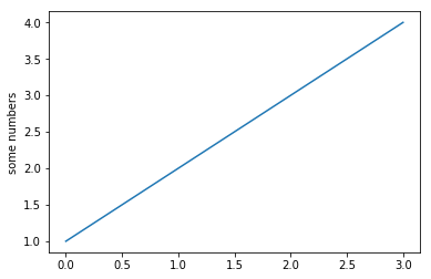
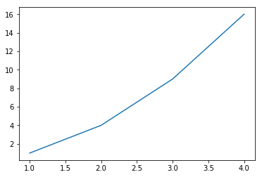
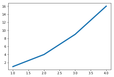
If you provide a single list or array of values to the plot() command matplotlib assumes they are Y values and automatically generates X values for you starting with 0. To plot X vs Y, pass plot() a second list or array of values:
plt.plot([1, 2, 3, 4], [1, 4, 9, 16])
plt.show()
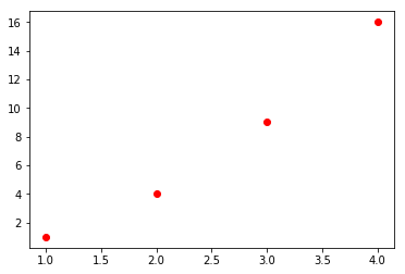
For every X,Y pair of arguments there is an optional format string that indicates the color and line type of the pair. The letters and symbols of the format string are from MATLAB, and you concatenate a color string with a line style string. The default format string is ‘b-‘, solid blue line. To change the above line to red dots you would use:
See plot() for a complete list of colors and line styles
x = [1, 2, 3, 4]
y = [1, 4, 9, 16]
plt.plot(x, y,'ro')
plt.show()
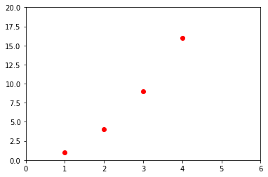
To change the viewport (or viewable area) use the axis() command which takes a list of [xmin, xmax, ymin, ymax]:
plt.plot(x, y, 'ro')
plt.axis([0, 6, 0, 20])
plt.show()
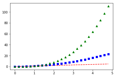
Under the hood matplotlib will convert all input arrays or lists to numpy arrays. The example below illustrates plotting several lines with different format styles:
import numpy as np
# evenly sampled time at 200ms intervals
t = np.arange(0., 5., 0.2)
# red dashes, blue squares and green triangles
plt.plot(t, t, 'r--', t, t**2, 'bs', t, t**3, 'g^')
plt.show()
Line Properties
Lines have many attributes you can set: linewidth, dash style, antialiased, etc. See matplotlib.lines.Line2D.
Line attributes can be set several different ways
- Use keyword args:
plt.plot(x,y, linewidth=4.0)
plt.show()
- Use the setter methods of a Line2D instance: plot returns a list of Line2D objects.
In the code below we will only plot one line so that the list returned is
of length 1. We use tuple unpacking with
line,to get the first element of that list.
See matplotlib.lines for a list of line style setters
line, = plt.plot(x,y,'-')
line.set_antialiased(False) #turn off Antialiasing
plt.show()
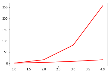
- Use the setp() command: The example below uses a MATLAB-style command to set multiple properties on a list of lines. setp works transparently with a list of objects or a single object. You can either use python keyword arguments or MATLAB-stype string/value pairs:
lines = plt.plot(x, y, x, np.power(y,2))
# use keyword args
plt.setp(lines, color='r', linewidth=2.0)
# or MATLAB style string value pairs
plt.setp(lines, 'color', 'r', 'linewidth', 2.0)
plt.show()
See here for a list of available properties or call the setp() function with a line or lines as the argument:
plt.setp(lines)
  agg_filter: a filter function, which takes a (m, n, 3) float array and a dpi value, and returns a (m, n, 3) array
  alpha: float (0.0 transparent through 1.0 opaque)
  animated: bool
  antialiased or aa: bool
  clip_box: a `.Bbox` instance
  clip_on: bool
  clip_path: [(`~matplotlib.path.Path`, `.Transform`) | `.Patch` | None]
  color or c: any matplotlib color
  contains: a callable function
  dash_capstyle: ['butt' | 'round' | 'projecting']
  dash_joinstyle: ['miter' | 'round' | 'bevel']
  dashes: sequence of on/off ink in points
  drawstyle: ['default' | 'steps' | 'steps-pre' | 'steps-mid' | 'steps-post']
  figure: a `.Figure` instance
  fillstyle: ['full' | 'left' | 'right' | 'bottom' | 'top' | 'none']
  gid: an id string
  label: object
  linestyle or ls: ['solid' | 'dashed', 'dashdot', 'dotted' | (offset, on-off-dash-seq) | ``'-'`` | ``'--'`` | ``'-.'`` | ``':'`` | ``'None'`` | ``' '`` | ``''``]
  linewidth or lw: float value in points
  marker: :mod:`A valid marker style <matplotlib.markers>`
  markeredgecolor or mec: any matplotlib color
  markeredgewidth or mew: float value in points
  markerfacecolor or mfc: any matplotlib color
  markerfacecoloralt or mfcalt: any matplotlib color
  markersize or ms: float
  markevery: [None | int | length-2 tuple of int | slice | list/array of int | float | length-2 tuple of float]
  path_effects: `.AbstractPathEffect`
  picker: float distance in points or callable pick function ``fn(artist, event)``
  pickradius: float distance in points
  rasterized: bool or None
  sketch_params: (scale: float, length: float, randomness: float)
  snap: bool or None
  solid_capstyle: ['butt' | 'round' |  'projecting']
  solid_joinstyle: ['miter' | 'round' | 'bevel']
  transform: a :class:`matplotlib.transforms.Transform` instance
  url: a url string
  visible: bool
  xdata: 1D array
  ydata: 1D array
  zorder: float
Using dataframes
In this section we will pull data from FRED and plot the data.
- HPIPONM226S is the Purchase Only House Price Index for the United States
- MSACSR is the Monthy Supply of Houses in the United States
import pandas_datareader as pdr
import datetime as dt
start = dt.datetime(1992,1,1)
end = dt.datetime.today()
df = pdr.data.get_data_fred(['HPIPONM226S','MSACSR'], start = start, end = end)
print(df.tail())
            HPIPONM226S  MSACSR
DATE
2018-06-01       264.28     6.0
2018-07-01       265.38     6.2
2018-08-01       266.44     6.4
2018-09-01       266.92     6.5
2018-10-01          NaN     7.4
Let’s plot our data with a basic plot command
plt.plot(df)
plt.show()
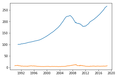
Note that matplotlib automatically selected the Date column for X values and gave our two columns different colors
Working with multiple figures and axes
In pyplot, it is possible to have multiple figures and axes all plotting commands apply to the current figure and axis. The function gca() returns the current axes, and gcf() returns the current figure. Normally you don’t have to worry about this because it’s all taken care of for you. Below we will plot our housing data in two separate subplots in the same figure:
plt.figure(1)
plt.subplot(211)
plt.plot(df.HPIPONM226S, '--')
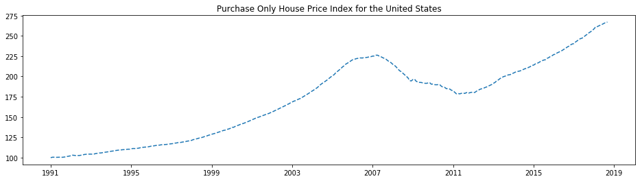
plt.title('Purchase Only House Price Index for the United States')
plt.subplot(212)
plt.plot(df.MSACSR)
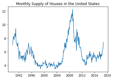
plt.title('Monthly Supply of Houses in the United States')
plt.show()
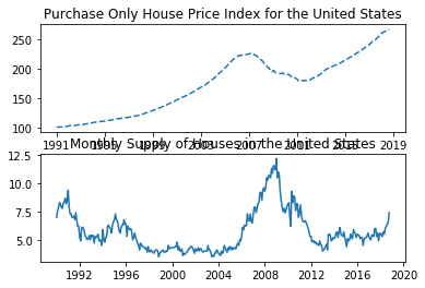
With these two plots in separate subplots we can see more variation in the Monthly supply of houses.
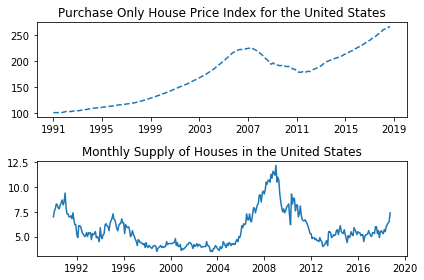
Note that the tick labels, axis labels and titles have written over eachother. Use plt.tight_layout()
to automatically adjust the subplot params to make space for tick labels, axis labels and titles.
plt.figure(1)
plt.subplot(211)
plt.plot(df.HPIPONM226S, '--')
plt.title('Purchase Only House Price Index for the United States')

plt.subplot(212)
plt.plot(df.MSACSR)
plt.title('Monthly Supply of Houses in the United States')

plt.tight_layout()

plt.show()
plt.figure(1) is optional because the figure will be created by default just as subplot(111) will
be created by default if not otherwise specified. The
subplot() command specifies
number of rows, number of columns and the subplot number (nrows, ncols, plot_number). The commas in
the subplot command are optional if nrows*ncols < 10. So subplot(211) is the same as subplot(2,1,1).
You can create an arbitrary number of subplots and axes. If you want to place an axes manually
(not on a rectangular grid) use the axes()
command, which allows you to specify the locations as axes ([left, bottom, width, height]) where all values are
in fractional (0 to 1) coordinates.
You can create multiple figures by using multiple figure() calls with an increasing figure number.
Each Figure can contain as many axes and subplots as you desire.
plt.figure(1)
plt.plot(df.HPIPONM226S, '--')
plt.title('Purchase Only House Price Index for the United States')

plt.figure(2)
plt.plot(df.MSACSR)
plt.title('Monthly Supply of Houses in the United States')

plt.show()
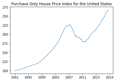
figure() has its own configurable properties so we can change the size, dpi, facecolor, edgecolor, linewidth, frame, or layout just like we would with lines in a plot:
plt.figure(1,figsize=(16,4))
plt.plot(df.HPIPONM226S, '--')
plt.title('Purchase Only House Price Index for the United States')
plt.show()
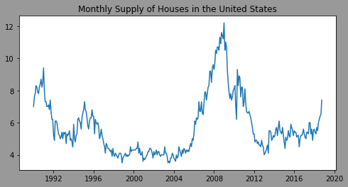
plt.figure(2,figsize=(8,4), facecolor=(0.6, 0.6, 0.6)) #using RGB color values
plt.plot(df.MSACSR)
plt.title('Monthly Supply of Houses in the United States')
plt.show()
You can clear the current figure with clf() and the current axes with cla().
If you working with a lot of figures you need to be aware that the memory required for a figure is not completely released until the figure is explicitly closed with close().
Working with text
The text() command can be used to add text in an arbitrary location, and the xlabel(), ylabel() and title() are used to add text in the indicated locations.
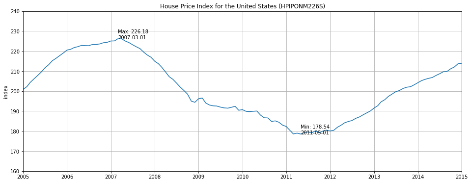
To make this more interesting we will be working with a subset of our HPI data:
hpi = df.HPIPONM226S.loc['2005-01-01':'2015-01-01']
We will add a ylabel with plt.ylabel(). Hopefully the x axis is obvious but a label could be added with plt.xlabel('date').
We’ll add text to indicate the min and max of the plot. We’ll also set the y axes limits with axes.set_ylim to
make a cleaner plot.
plt.figure(figsize=(16,6))
plt.plot(hpi)

plt.title('House Price Index for the United States (HPIPONM226S)')
plt.grid(True)

axes = plt.gca()
axes.set_ylim([160, 240])
axes.set_xlim([hpi.index[0],hpi.index[-1]])

plt.text(
    hpi.idxmin(),hpi.min(),
    'Min: '+str(hpi.min())+'\n'+hpi.idxmin().strftime('%Y-%m-%d')
)
plt.text(
    hpi.idxmax(),hpi.max(),
    'Max: '+str(hpi.max())+'\n'+hpi.idxmax().strftime('%Y-%m-%d')
)

plt.show()
Annotating text
The uses of the basic text() command above place text at an arbitrary position on the axes. A common use for text is to annotate some feature of the plot and the annotate() method provides helper functions to make annotations easy. In an annotation, there are two points to consider: The location being annotated represented by the argument xy and the location of the xytext. Both of these arguments are (x,y) tuples.
from datetime import datetime

plt.figure(figsize=(16,6))

plt.plot(hpi)

plt.ylabel('index')
plt.title('House Price Index for the United States (HPIPONM226S)')
plt.grid(True)

axes = plt.gca()
axes.set_ylim([160, 240])
axes.set_xlim([hpi.index[0],hpi.index[-1]])

plt.text(hpi.idxmin(),hpi.min(),'Min: '+str(hpi.min())+'\n'+hpi.idxmin().strftime('%Y-%m-%d'))
plt.text(hpi.idxmax(),hpi.max(),'Max: '+str(hpi.max())+'\n'+hpi.idxmax().strftime('%Y-%m-%d'))


plt.annotate('When I bought my house\n'+str(hpi.loc['2005-12-01']),#String to be printed
             xy=(datetime.strptime('2005-12-01','%Y-%m-%d'),hpi.loc['2005-12-01']),#Arrow Tip
             xytext=(datetime.strptime('2005-02-01','%Y-%m-%d'),hpi.loc['2005-12-01']+10),#lower left hand corner of text
             arrowprops=dict(facecolor='black', shrink=0.05, width=1.0)#Arrow Properties
            )

plt.annotate('When I sold my house\n'+str(hpi.loc['2011-07-01']),
             xy=(datetime.strptime('2011-07-01','%Y-%m-%d'),hpi.loc['2011-07-01']),
             xytext=(datetime.strptime('2011-07-01','%Y-%m-%d'),hpi.loc['2011-07-01']-10),
             arrowprops=dict(facecolor='black', shrink=0.05, width=1.0)
            )

plt.show()
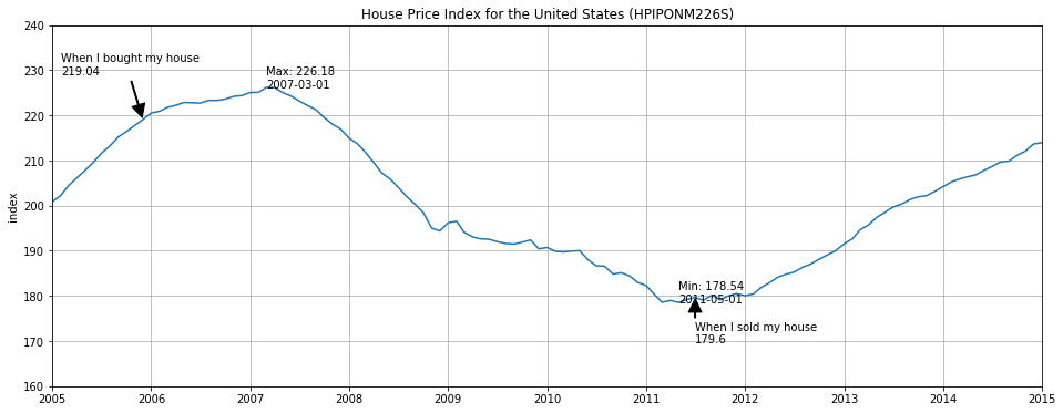
This is a basic example of annotations, there are a variety of other annotation options - See Basic annotation and Advanced Annotation for details.
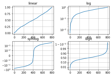
Logarithmic and other nonlinear axes
matplotlib.pyplot supports not only linear axis scales, but also logarithmic and logit scales. This is commonly
used if data spans many orders of magnitude. Changing the scale of an axis is done with plt.xscale():
plt.xscale('log')
An example of four plots with the same data and different scales for the y axis is shown below.
from matplotlib.ticker import NullFormatter  # useful for `logit` scale

# Fixing random state for reproducibility
np.random.seed(19680801)

# make up some data in the interval ]0, 1[
y = np.random.normal(loc=0.5, scale=0.4, size=1000)
y = y[(y > 0) & (y < 1)]
y.sort()
x = np.arange(len(y))

# plot with various axes scales
plt.figure(1)

# linear
plt.subplot(221)
plt.plot(x, y)
plt.yscale('linear')
plt.title('linear')
plt.grid(True)


# log
plt.subplot(222)
plt.plot(x, y)
plt.yscale('log')
plt.title('log')
plt.grid(True)


# symmetric log
plt.subplot(223)
plt.plot(x, y - y.mean())
plt.yscale('symlog', linthreshy=0.01)
plt.title('symlog')
plt.grid(True)

# logit
plt.subplot(224)
plt.plot(x, y)
plt.yscale('logit')
plt.title('logit')
plt.grid(True)
# Format the minor tick labels of the y-axis into empty strings with
# `NullFormatter`, to avoid cumbering the axis with too many labels.
plt.gca().yaxis.set_minor_formatter(NullFormatter())
# Adjust the subplot layout, because the logit one may take more space
# than usual, due to y-tick labels like "1 - 10^{-3}"
plt.subplots_adjust(top=0.92, bottom=0.08, left=0.10, right=0.95, hspace=0.25,
                    wspace=0.35)

plt.show()
Key Points
Use matplotlib to plot data